Mark Em Murals

2025 Q2

Golden Sunrise Mind & Body

Elegant wellness brand & website
See it in the wild
Mockup showing the Golden Sunrise website on a MacBook Pro in the Chrome browser and the same on an iPhone 12 in the Safari browser. The gold laptop shows the above-the-fold section of the home page with the heading "Heal and Thrive: Holisitic Wellness for Survivors." Its desktop background features a textured pattern of golden kintsugi cracks. The phone shows the scrolled home page with the mobile nav menu open. The "Meet Our Founder" section of the page is visible.

“I tried creating my own website, and I just couldn’t get it to connect with my vision. I needed Sierra more than I realized. She takes everything into account. Her design skills are exceptional, and she will bring your vision to life.”

— Annetta Allison,
Golden Sunrise Mind & Body

First, Study the Competition

To help this new business stand out amid competitors in the wellness space, I avoided overused choices like:

  • Light green as a primary brand color
  • A geometric sans as a primary display font
  • Lotus flower or leaf logos

Two Mood Boards, One Concept

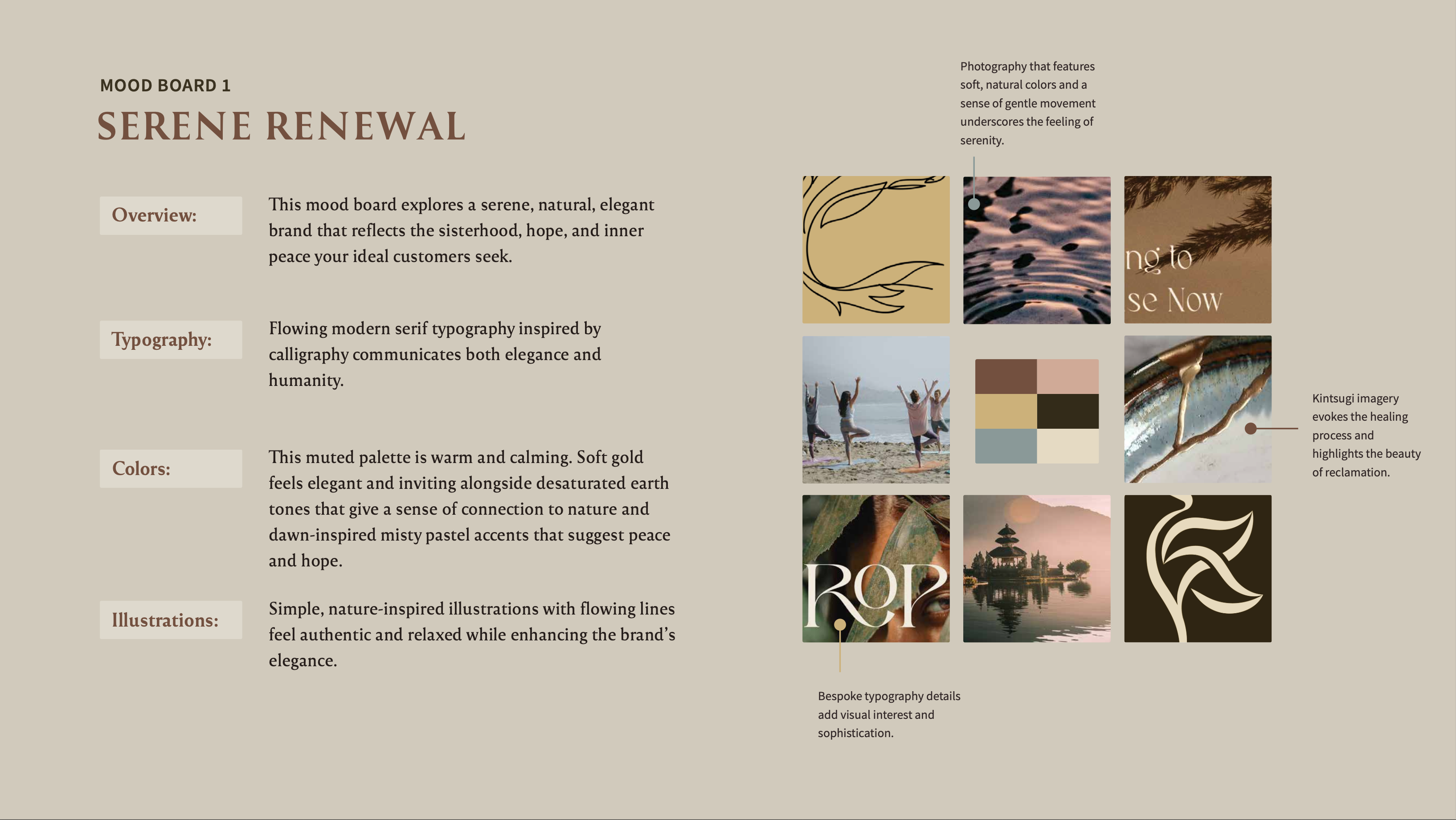
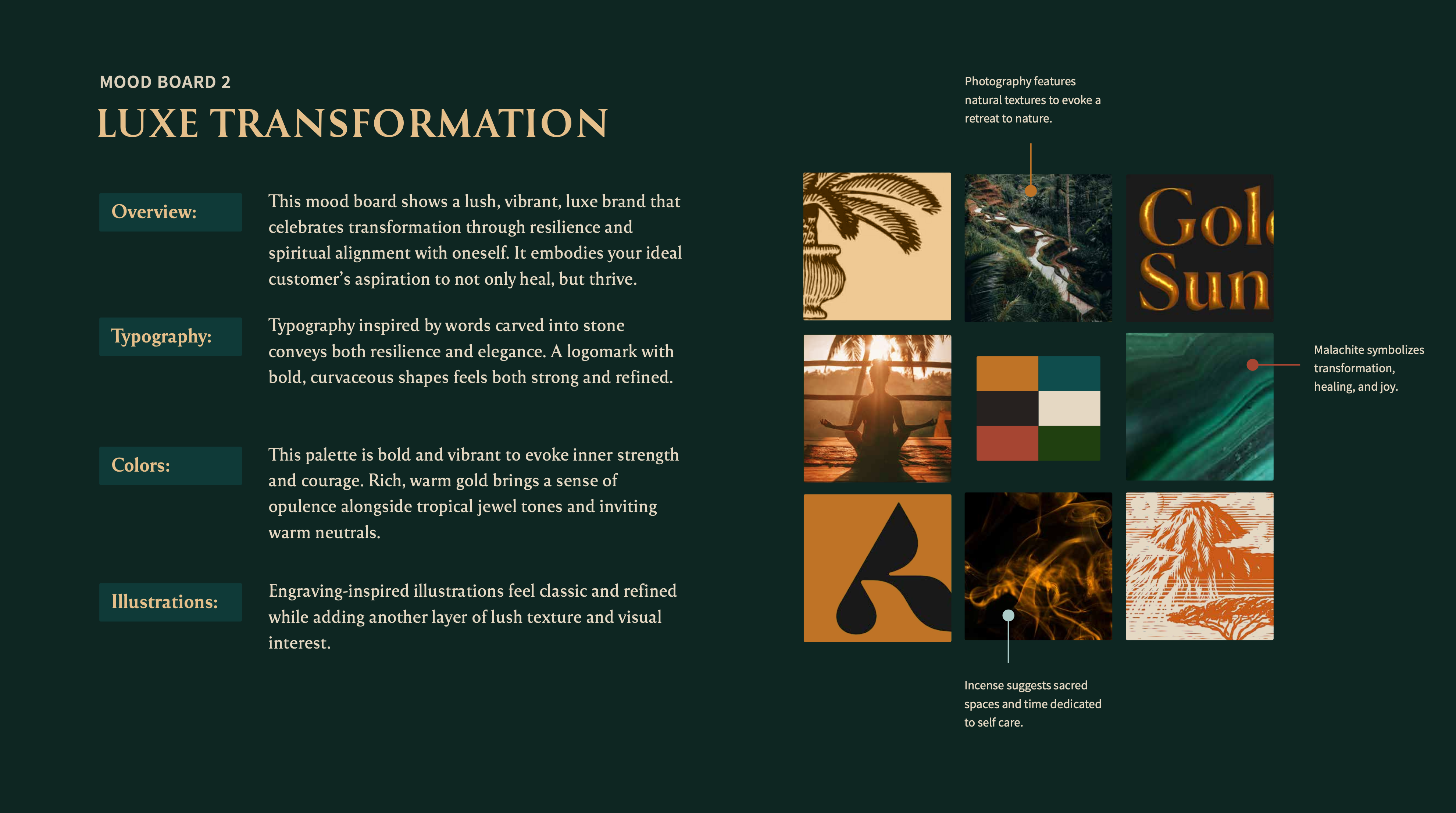
I crafted two mood boards so that my client and I could explore possible creative directions. This allowed Annetta to choose a look and feel that resonated with her before I developed a brand identity around it.

She loved both options but ultimately chose the Serene Renewal option because its tranquility would appeal most to her target audience.

Mood Board 1: Serene Renewal explores a serene, natural, elegant brand that reflects the sisterhood, hope, and inner peace sought by the brand's ideal customers. It features elegant and human flowing modern serif typography inspired by calligraphy, a warm and calming muted palette, and simple, nature-inspired illustrations with flowing lines for an authentic and relaxed feel. Photographs of rippling water and kintsugi pottery feature soft, natural colors and a sense of gentle movement to enhance the feeling of serenity.Mood Board 2: Luxe Transformation explores a lush, vibrant, and luxe brand that embodies the ideal customer's aspiration to not only heal, but thrive. It features typography inspired by words carved into stone to convey both resilience and elegance. The color palette evokes inner strength, courage, and opulence by pairing inviting warm neutrals with vibrant tropical jewel tones and a rich, warm gold. Engraving-inspired illustrations and photographs of tropical nature feel classic and refined while adding lush texture.

What’s in a Brand Name?

Annetta had been struggling to choose an appropriate brand name, so I suggested one that:

  • Clearly communicates the industry (an essential characteristic of brand names for new companies because they need to build recognition) but avoids the vague term “wellness”
  • Is broad enough to encompass the range of holistic wellness services the company will offer
  • Both evokes hope and tranquility and suits the elegant, respectful, and welcoming vibe that will appeal to the target audience

Not Just a Logo

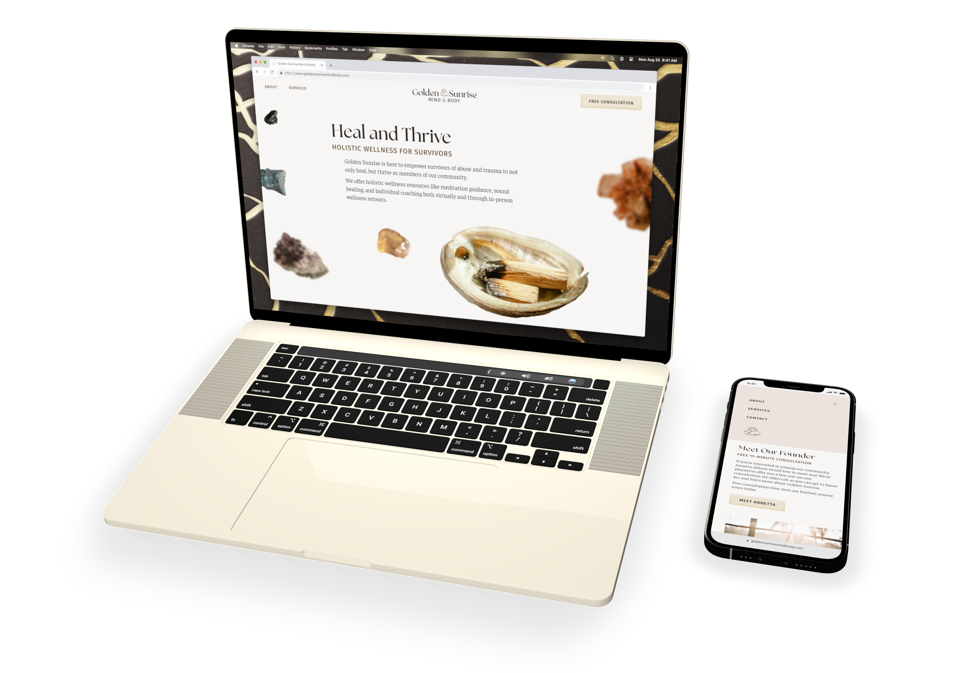
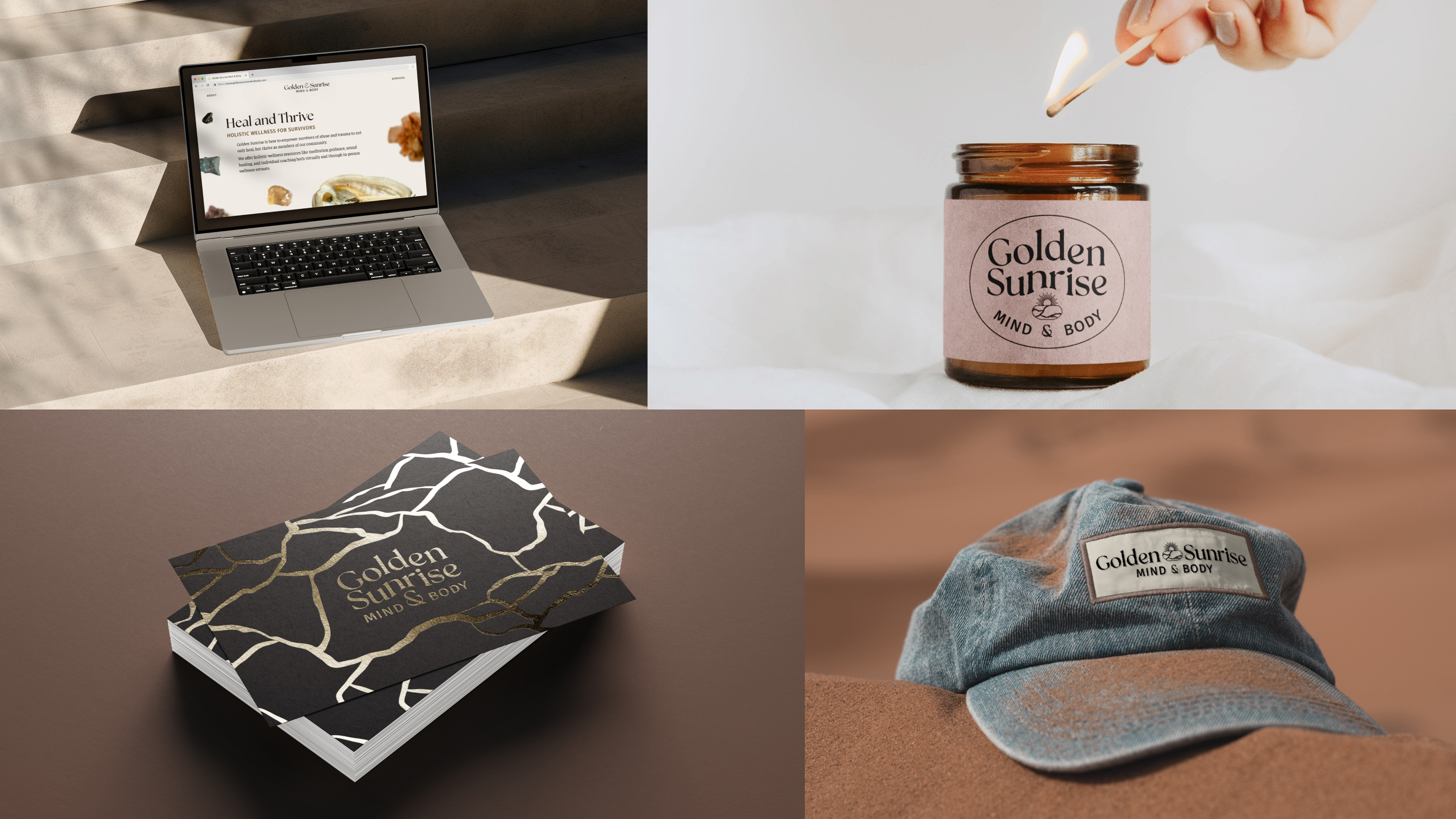
I designed a full responsive logo suite to ensure that the brand identity can adapt to fit different spaces and contexts.

  • The primary logo uses a stacked layout and features customized flowing typography.
  • The secondary logo has a horizontal layout to fit wide and short spaces like the website header.
  • The submark logo is an expanded version with an oval frame for use in larger areas, like on merchandise.
  • The logomark offers a compact variation for use in small spaces where text may not be legible, like social icons or the website favicon.
The full Golden Sunrise logo suite, which uses an elegant calligraphy-inspired modern serif font paired with a humanist sans serif. Customized characters include a relaxed and rounded lowercase "e" and a bespoke rounded ampersand to highlight the connection between  mind and body that is central to the brand's holistic wellness practice. In the primary logo, customized flowing text uses negative space to reveal the arched shape of a sunrise. The secondary logo features a central icon of the sun rising above a bowl with kintsugi cracks to highlight the beauty of reclamation and recovery. The submark logo incorporates both flowing arched text and the kintsugi sunrise icon inside an ellipical frame that harmonizes with the shape of the kintsugi bowl. The logomark uses the icon alone. Annotations note that the sun is more than halfway up to communicate the brand's positive "glass half full" perspective. The position and shape of the kintsugi pot with flowing cracks suggests the rippled reflection of the rising sun on water.

Muted and Meaningful Colors

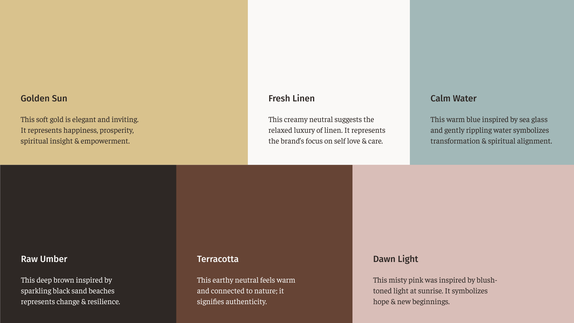
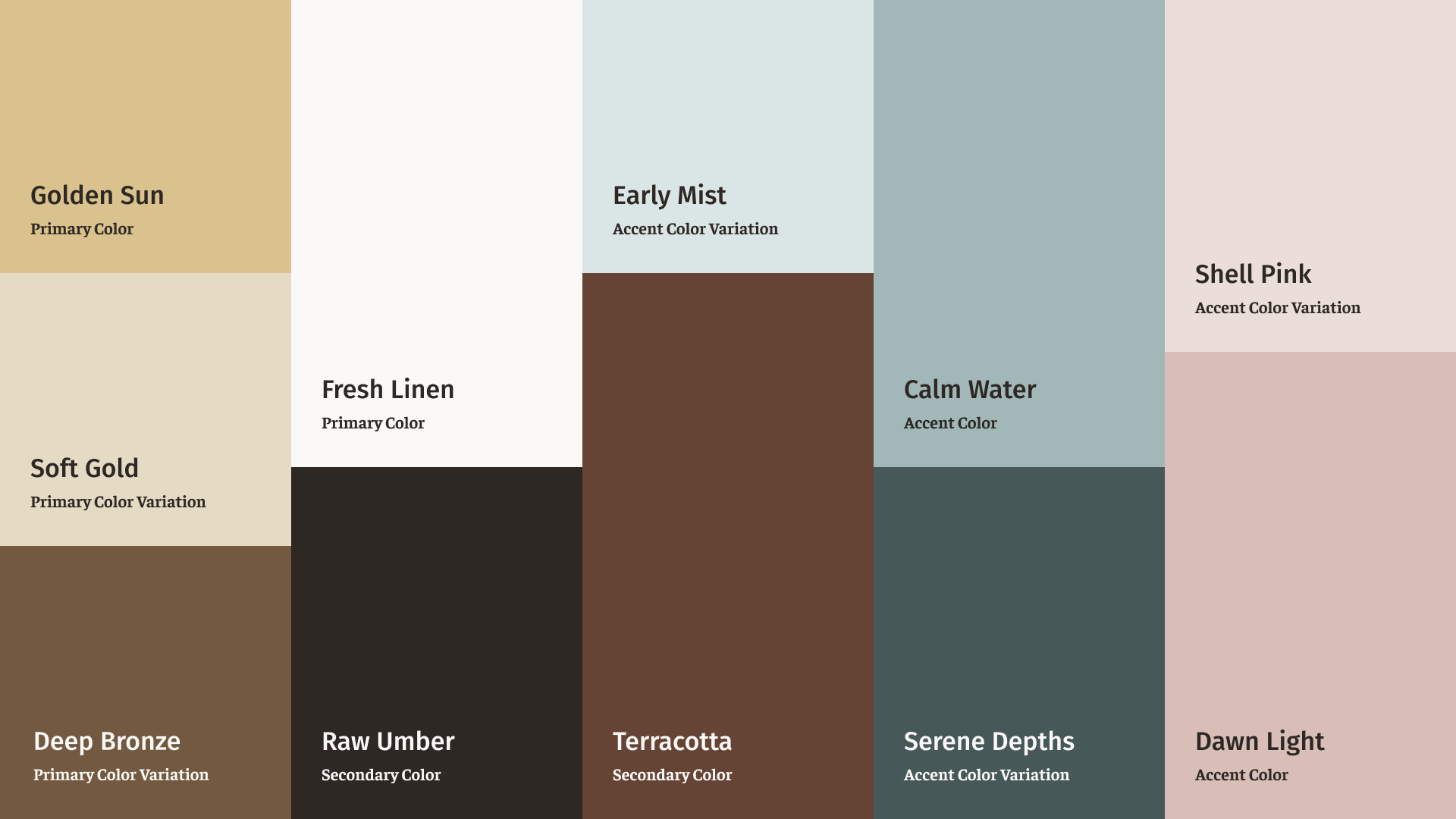
Because the best brand colors are evocative as well as practical, I used the list of brand values that Annetta and I defined together along with images of beaches, tropical retreats, and early morning photography as inspiration for the Golden Sunrise color palette. The result feels warm, tranquil, and elegant.

Values: Empowerment, Community, Resilience, Authenticity, Self Love & Care, Spiritual AlignmentBrand color palette: Golden Sun is a soft gold that symbolizes empowerment. Fresh Linen is a creamy white that represents self love & care. Calm Water is a warm blue that symbolizes spiritual alignment. Raw Umber is a black-brown that represents resilience. Terracotta is a midtone muted warm brown that symbolizes authenticity. Dawn Light is a misty pink that evokes hope and new beginnings.Color palette with hierarchy and variations. Golden Sun is the primary brand color and has Soft Gold and Deep Bronze as light and dark variations. Fresh Linen is another primary color. Raw Umber and Terracotta are secondary colors. Calm Water is an accent color with Early Mist and Serene Depths as light and dark variations. Dawn Light is an accent color with Shell Pink as a lighter variation.

Brand in Action

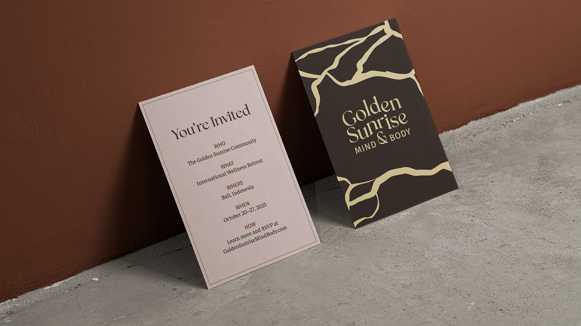
In addition to the responsive Squarespace website, I designed a full brand guide, printable business cards with a gold foil detail, and inspirational mockups to prepare the brand for use in a wide range of contexts.

Mockups showing the brand in action.  1: The Golden Sunrise website landing page shown on a MacBook Pro laptop that sits on stairs in dappled sunlight. 2: The submark logo printed on a jarred candle's label as it sits on white linen ground and is about to be lit by a woman's hand. 3: A stack of business cards that show the primary logo framed by the kintsugi-inspired brand pattern, printed in gold foil on a dark umber backgorund. 4: A denim baseball hat on rust-colored sand with an embroidered patch showing the secondary logo.This page of the brand guide shows how the Golden Sunrise brand assets and photography style would look when used on social media. Illustrations of kintsugi cracks are shown in use as both photo overlays and Instagram story highlight images.Mockup shows the front and back of an invitation printed on cardstock  sitting on a taupe concrete floor and leaning against a terracotta-painted wall. The front heading reads "You're Invited" on a blush pink background. Body text reads "WHO The Golden Sunrise Community WHAT International Wellness Retreat WHERE Bali, Indonesia WHEN October 20–27, 2025 HOW Learn more and RSVP at GoldenSunriseMindBody.com". The back shows the Golden Sunrise logo framed by the brand pattern's golden kintsugi cracks against a raw umber background. Mockups showing the brand in action. 1: Elegant storefront window printed with the primary logo in soft white framed by golden kintsugi cracks. 2: Folded tissue paper printed with the golden kintsugi cracks brand pattern, with a sticker that reads "A Gift for You from Golden Sunrise Mind & Body." 3: The full-color primary logo against a  background of sunlit, rippling water. 4: Stacks of business cards showing the front and back of Annetta Allison's business cards.
More Projects
Text reads “Sharma Speech & Language: Friendly & Professional Accent Coaching. Website, illustrations, copywriting, Squarespace dev.” Mockup of a Surface laptop showing the website landing page. The image has a retro grain texture, and the image looks like a black and white print ad in a sans serif font. On hover, rich purple and orange-red brand colors are revealed.
Text reads “Moodstream: Less browsing, more watching.” Mockup of a MacBook showing the streaming website design with details for the movie Nope and an iPhone showing the landing page. This black and white print ad uses rounded sans serif typography and and quadruple underline decorations that evoke 1970s and 80s stereo equipment branding. On hover, a dark halftone background and rainbow gradient brand colors are revealed.

Let’s get in touch.

Just click the button below and tell me about your design problems, goals, and wildest dreams. Even if you don’t hire me, you’ll meet a good listener with a curious mind and a unique perspective.

Drop me a quick line and I’ll reply within one business day.

Imagine what your team can accomplish when I join it. If you give me a chance, I could be your best hire ever.

All you need to do is reach out.

... Oh, you’re still here! You’re a rare one, truly; I’d love to meet you. Why don’t you click this button?

Grainy photo of a 20th century typewriter. On hover, it shifts from black and white to color. The body is a vintage teal green and the delete key is the crimson brand color.
Hire Me