“Brilliant work.”
— Abrar Quader,
campaign manager

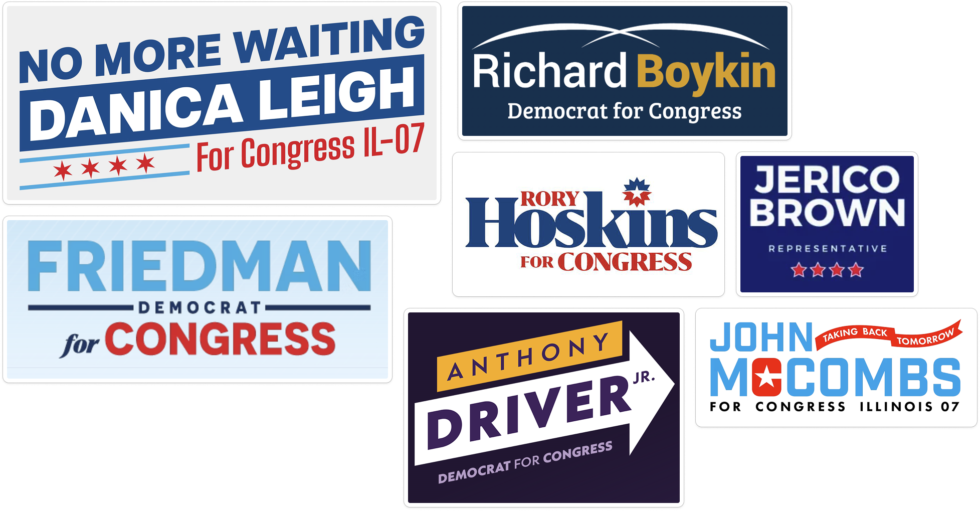
One of the campaign’s first big challenges was figuring out how to help Anabel stand out in a crowded race.
Cass collected competitor logos so we could see what we were up against and used their similarities to create a working list of design choices we’d need to avoid:
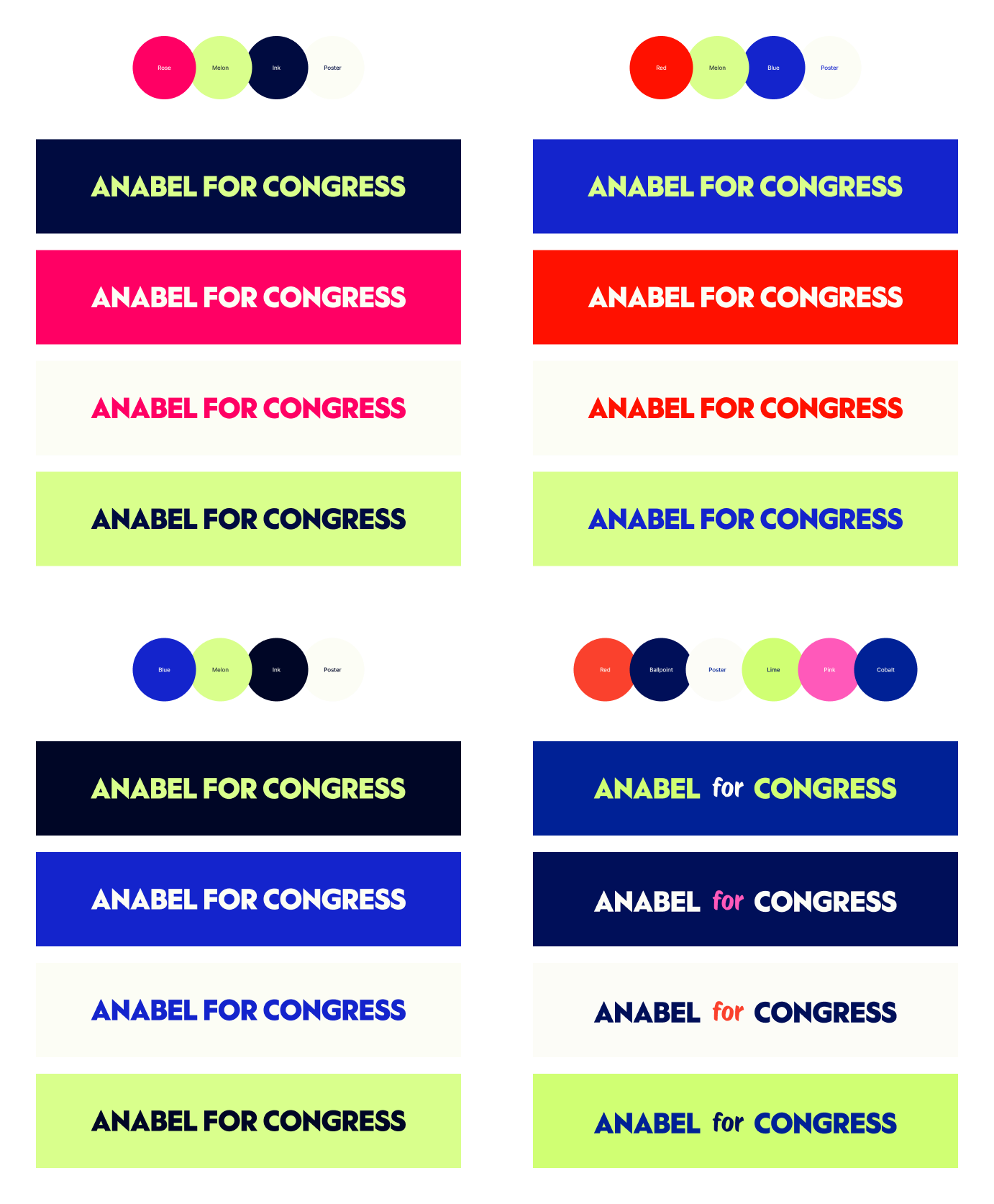
With this in mind, we decided to choose bright, saturated colors that would feel bold and different alongside Anabel’s competition for the Democratic nomination in her district.
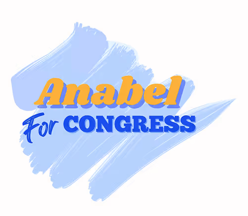
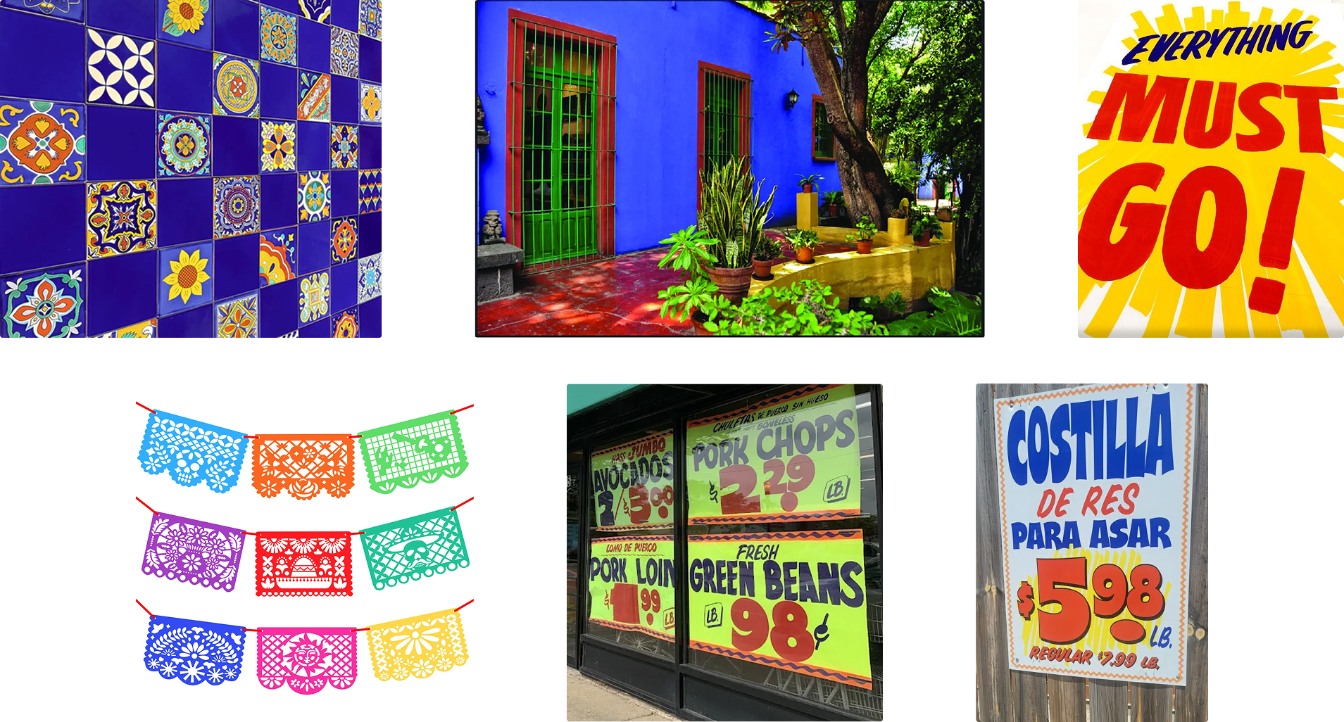
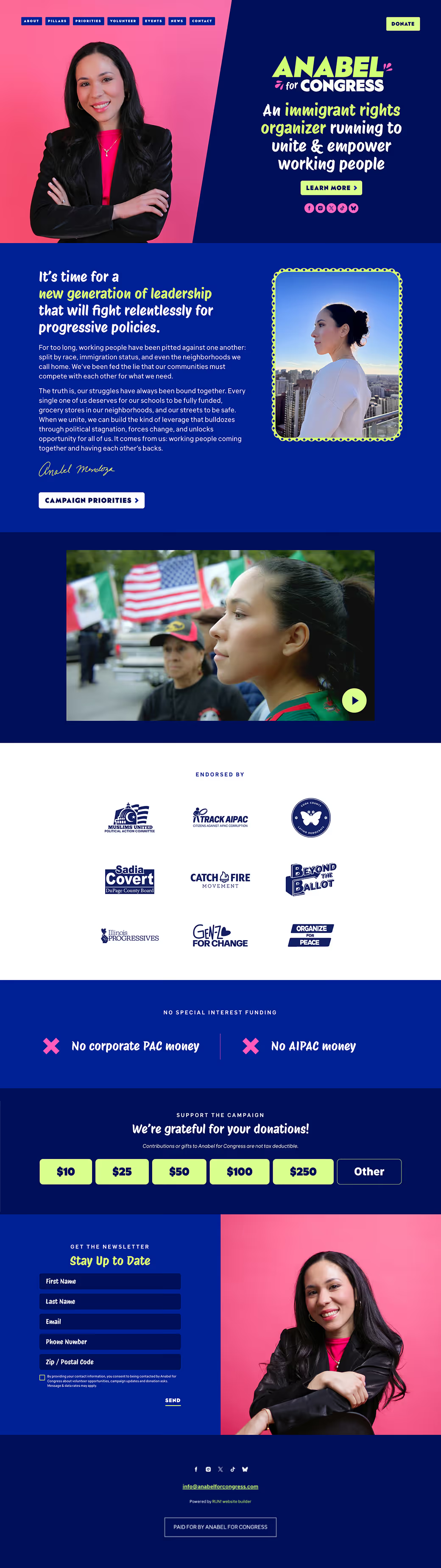
Our visual inspiration came from Anabel’s roots as a proud Latina and lifelong Chicagoan. The brand colors, pattern, and other assets were informed by papel picado, Mexican tile patterns, and Chicago’s corner store signage.
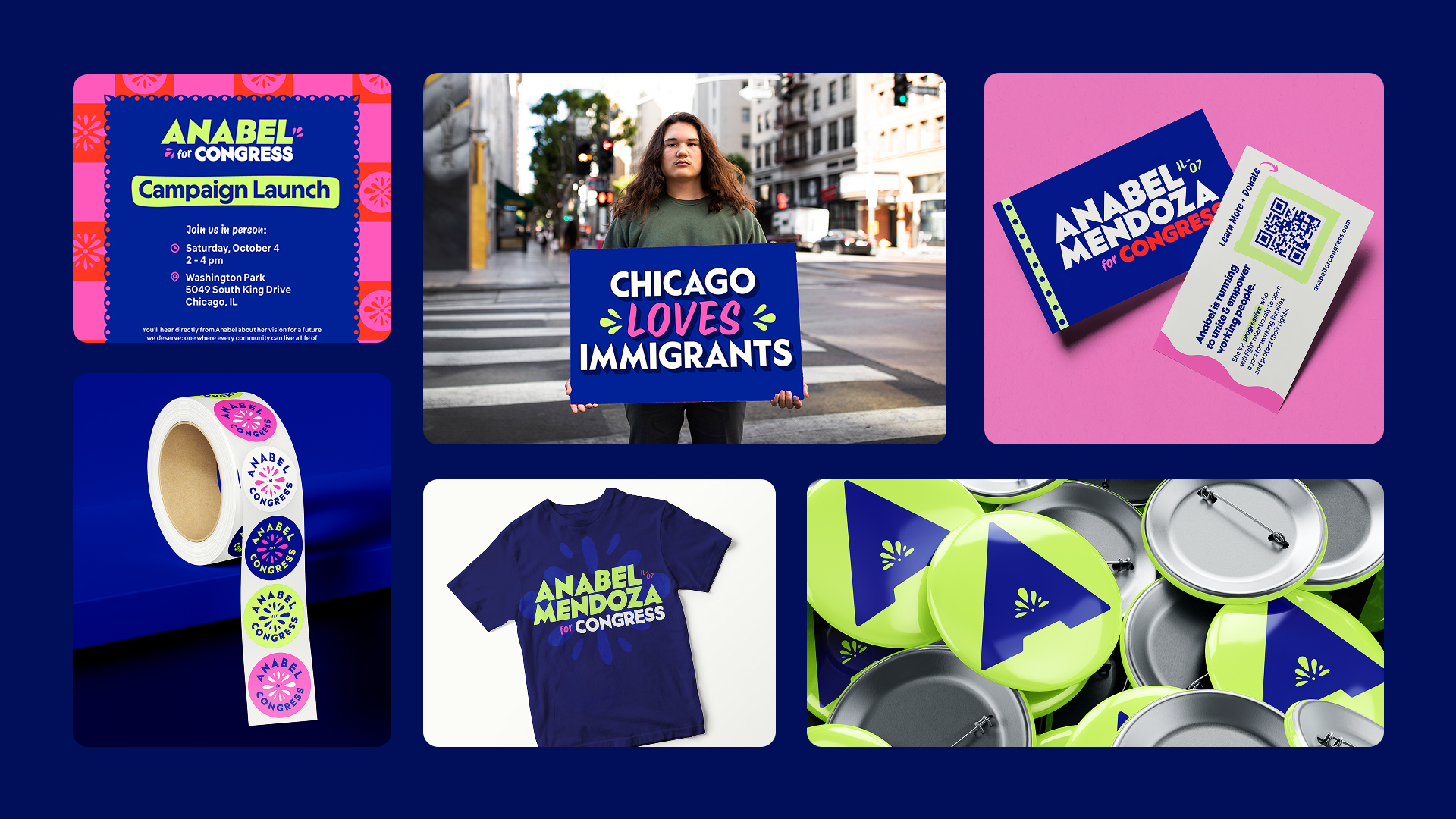
Cass and I needed to build the brand’s visual language quickly so that the first round of walk cards could be printed in time for early canvassing events.
We worked together to choose some possible brand fonts and then decided to divide and conquer so we could work as quickly as possible. While Cass began to design the wordmark, I selected some potential color palettes. By working in parallel and giving each other frequent feedback, we were able to both work much more rapidly and produce better work than would have been possible in isolation.
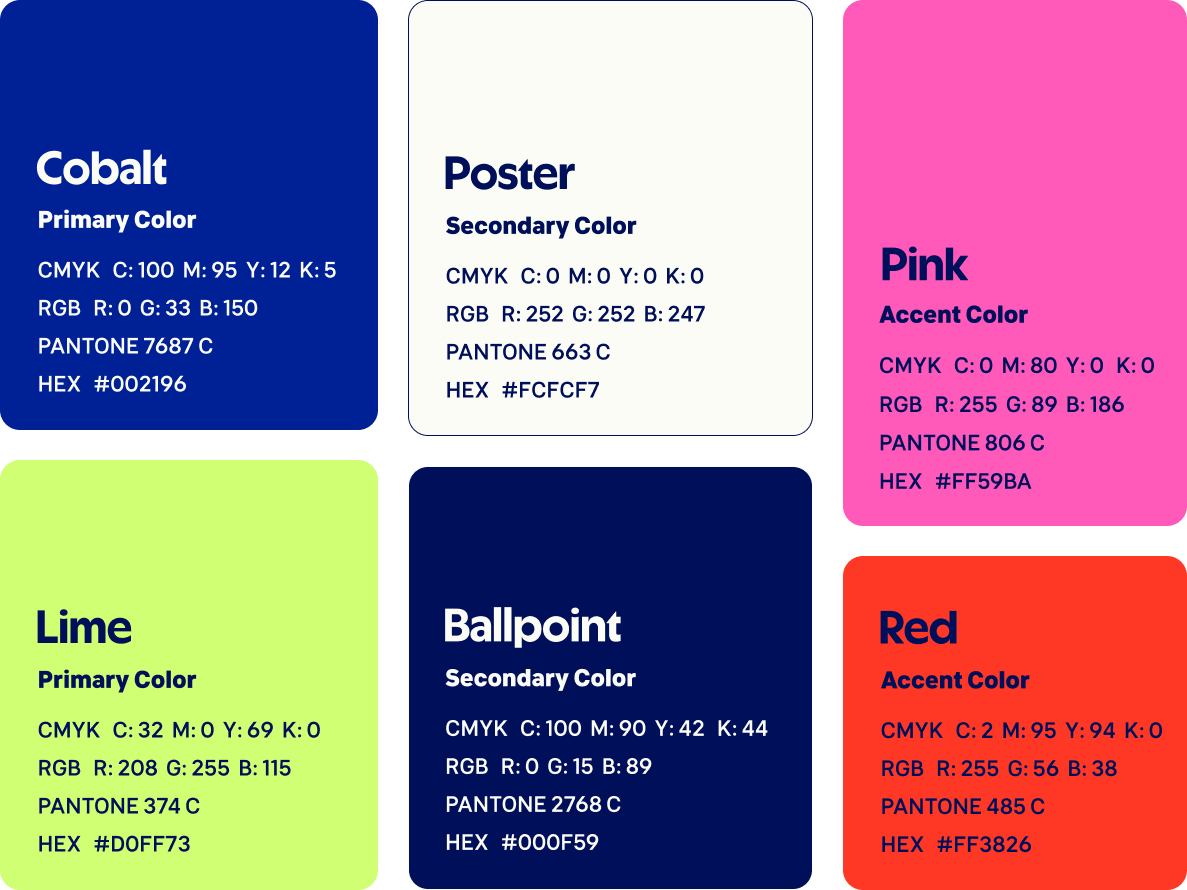
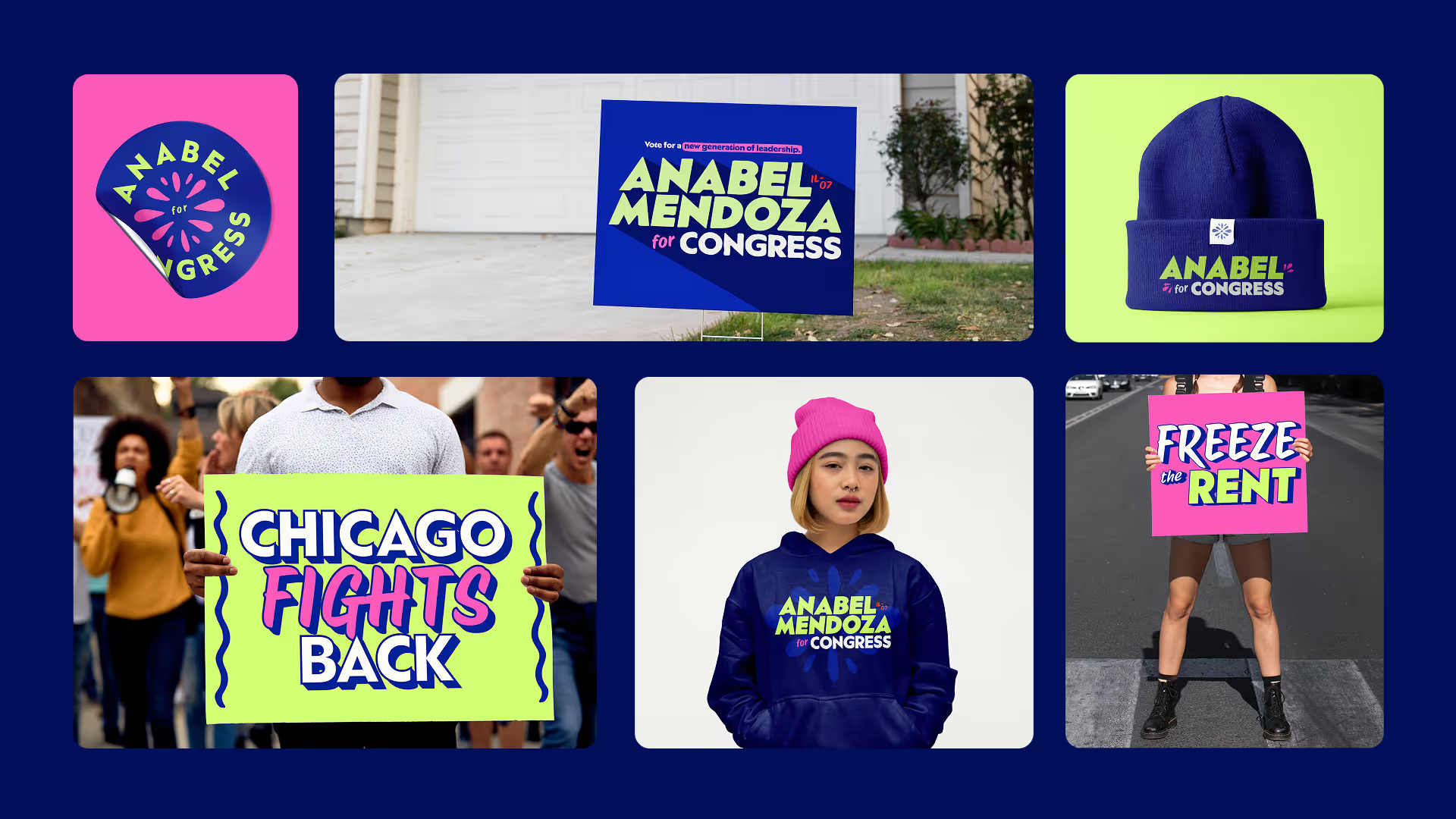
We chose cobalt & lime as bold primary brand colors, navy & white as high-contrast secondary brand colors, and pink & red as accent colors.
This juxtaposition of patriotic colors against zingy neon pink and lime feels fresh and bold but is still easy to recognize as political campaign branding.
Because this brand is for a grassroots campaign, Cass and I needed to choose high-quality free fonts that aren’t overused.
Type designer Matthew Hinders-Anderson designed the “fonts for a progressive future” that we chose as the primary and body typefaces, while the accent typeface is a Google font.
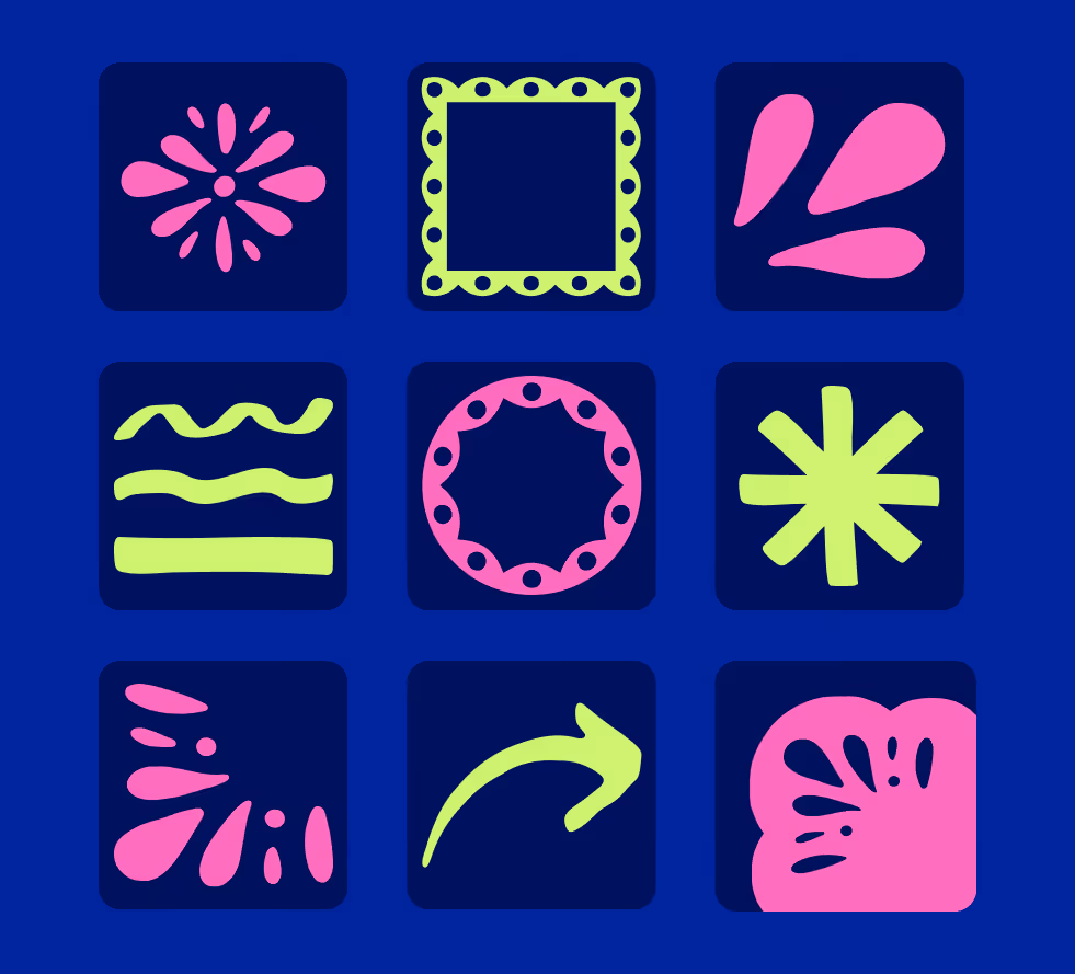
The hand-drawn brand assets include highlights inspired by Chicago’s corner store signage as well as flowers, flourishes, and scalloped borders inspired by papel picado patterns.
The assets’ simplified lines and limited yet vibrant color palette feel both relatable and fresh, which reflects the brand’s values of authenticity and progress, while the checkered brand pattern evokes Mexican ceramic tiles.

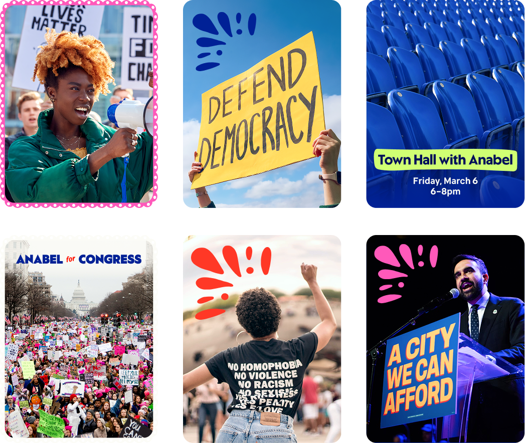
To match the brand’s bold optimism, we suggested a photography style that features:
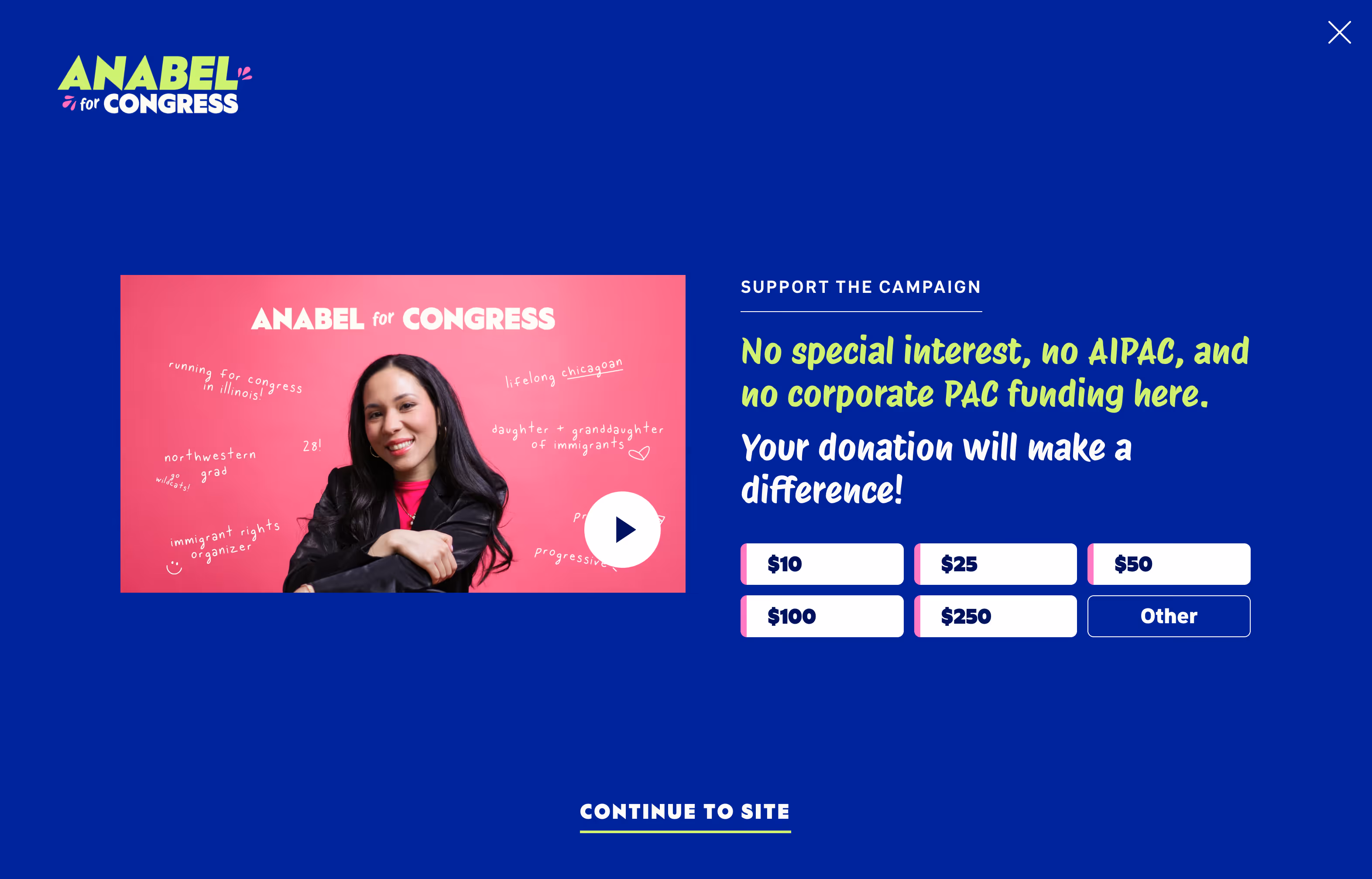
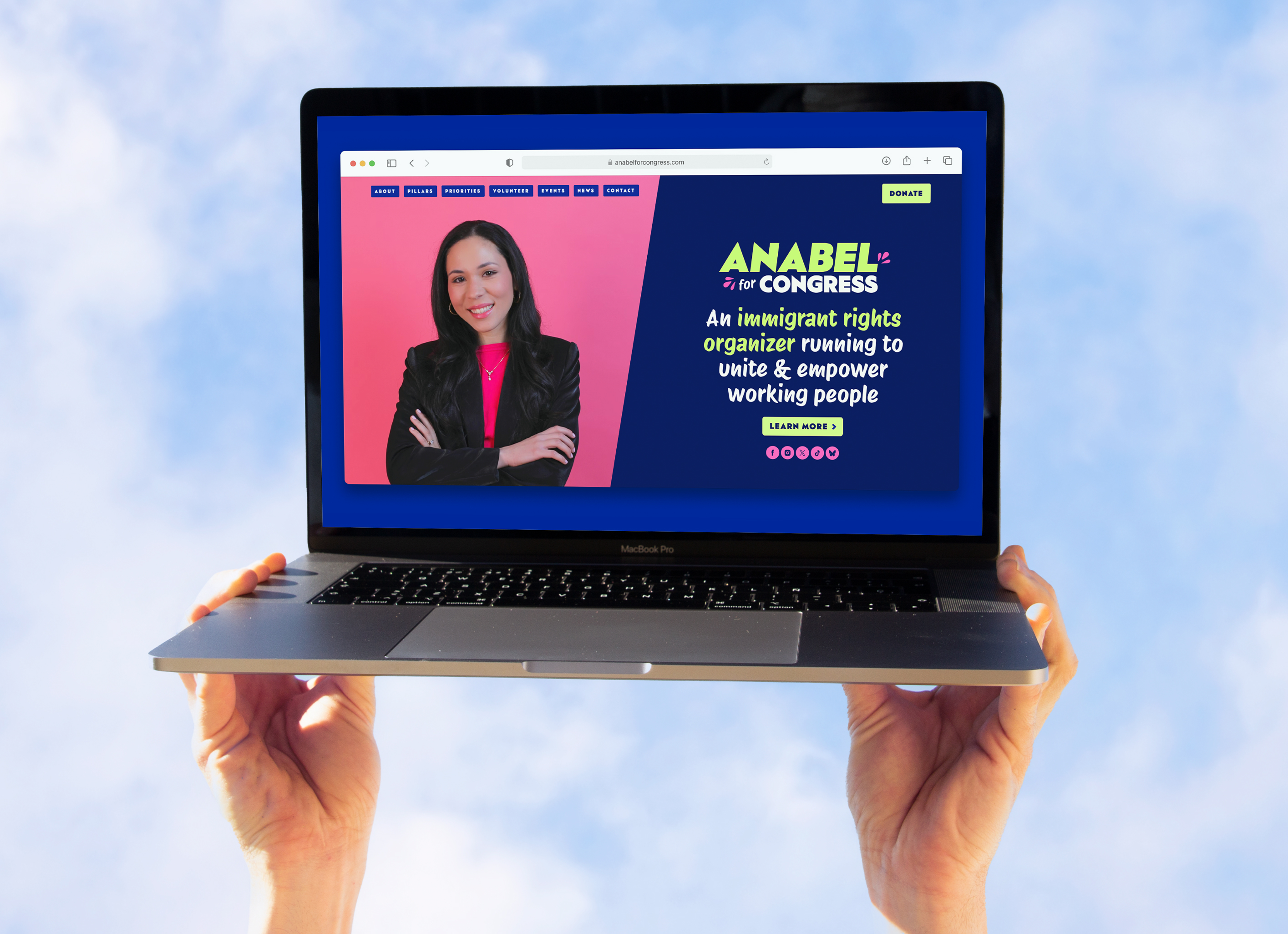
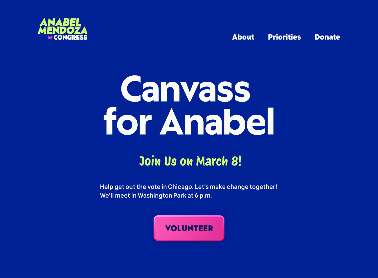
When we came on board, the campaign had already put up a preliminary website using the RUN! site platform. There wasn’t room in the budget to build the site from scratch, so we worked within RUN!’s unusually tight constraints to overhaul the design without doing a full rebuild.
A friend pointed out that the ActBlue donation links on an earlier version of Anabel’s site didn’t preselect the amount chosen by the user, which added an extra click to the process of donating. To remove this unnecessary friction, I linked each of the dollar amount buttons to the corresponding amount on the ActBlue page.
For example, the $10 button links to: secure.actblue.com/donate/anabelforcongress?refcode=website&amount=10.
Another problem I solved during this web refresh involved reconfiguring the way the site’s forms collected data.
While updating the volunteer form so that users could check multiple boxes in the “How would you like to volunteer?” section, I noticed that all three of the site’s forms—Volunteering, Contact, and Newsletter Signup—had been set up to feed data into a single Google Sheet, and there was no clear way to tell which form had collected each entry. This was both confusing for the team and not great for the user experience because, for example, not everyone who uses the contact form is necessarily interested in volunteering.
The Volunteering, Contact, and Newsletter forms now send data to for each form, which makes it possible to provide better UX for all future submissions
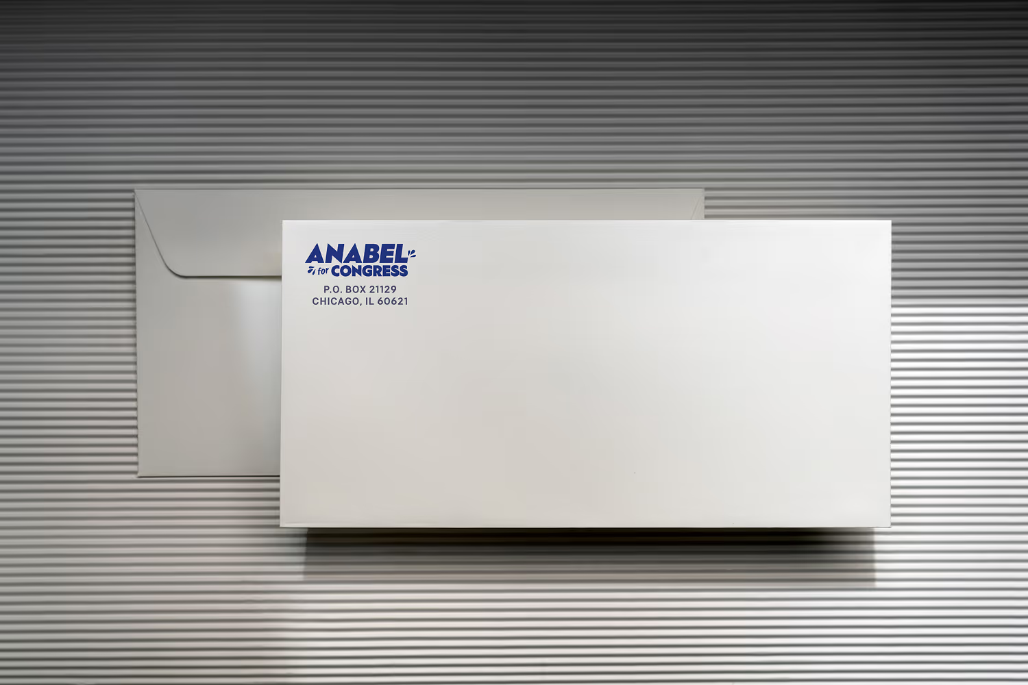
I also designed the campaign’s printable stationery, including letterhead and envelopes. The horizontal variation of the logo fit perfectly on the letterhead but was too wide to fit comfortably in the return address section of the envelope, so I used a narrower variation there.
The letterhead needed to be available via Google Docs so that anyone on the team could use it without issue. This presented a problem; someone might choose an off-brand body font.
To make this a bit less likely, I selected a default Google font for the template. Public Sans is so clean and simple that most people wouldn’t notice the swap.

Just click the button below and tell me about your design problems, goals, and wildest dreams. Even if you don’t hire me, you’ll meet a good listener with a curious mind and a unique perspective.
Drop me a quick line and I’ll reply within one business day.
Imagine what your team can accomplish when I join it. If you give me a chance, I could be your best hire ever.
All you need to do is reach out.
... Oh, you’re still here! You’re a rare one, truly; I’d love to meet you. Why don’t you click this button?
